When you think of a poster, you might be thinking of it hanging on a teenager’s bedroom wall rather than in an art museum. But for almost 40 years, Colorado State University has been showing off the poster’s more artistic look -- along with its message.
“Posters in general are a great medium both for their economics and their portability, but also because they really do allow for what graphic design is really about, which is communicating strongly through image and typography and language and to make statements that can really reach people deep down,” said Jason Frazier.
The CSU art professor is the co-director for the Colorado International Invitational Poster Exhibition. The biennial event honors the art and the impact of the form.
With the deep divide -- politically and socially -- across the country right now, Frazier says the role of the poster might be more important than ever.
“Art in general -- and the poster in our context -- really is a great vehicle for that because it allows somebody to express a frustration or to introduce something bigger to the conversation that forces people to think about their own position or their own preconception about something,” he said.

Philadelphia graphic artists Joe Scorsone and Alice Drueding have been expressing their frustrations through posters for more than 20 years. As the 2017 CIIPE honor laureates, Scorsone and Drueding have a retrospective of their work on display in the university’s Gregory Allicar Museum of Art.
“What I like about posters is that unlike other forms of graphic design, it’s pretty ephemeral,” Scorsone said. “Posters have a life -- like, let’s say if you do a poster for a music festival and it’s there to announce the event but then after the event, if you like that poster it becomes part of the environment. People frame them. They put them up. It’s the one form of graphic design that has a life after its initial use.”
In the early 1990s, Scorsone and Drueding ran a commercial graphic design business. Their clients included arts groups such as dance companies and music festivals, who commissioned posters.
But when government funding for a lot of those arts organizations dried up, there was no more money for posters. The duo missed that element of their work, but soon realized they could still design posters -- they just needed to change their focus.
“The preconception we had is that to do design you needed a client,” Drueding said. “Then we realized you could be your own client.”

Now the posters they design are for themselves.
“This is our voice,” Drueding said. “This is our chance; this is the way we contribute to the conversation.”
A large percentage of the conversations they contribute to are about hunger, the environment, immigration and human rights.
“You know, one poster is not going to change the world,” Drueding said. “But it’s all of our voices together, it’s the unity of the voices, and the very different ways we express our ideas about the same sort of themes.”

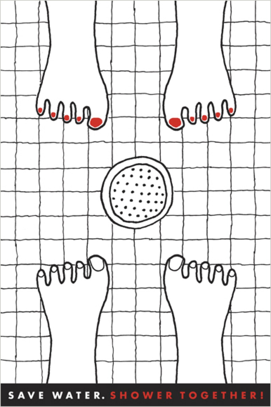
Sometimes the posters are silly, like one they did for water conservation. The poster shows a top-down view of two pairs of cartoonish-looking feet facing each other. In the center is a shower drain, and at the bottom of the poster it states: “Save water. Shower together.”
“We do have a terrible crisis -- and a growing crisis -- with the availability of water,” Drueding said. “We decided to do a poster that sort of made the idea of saving water a fun idea.”
But sometimes you need a little shock value, Scorsone said, pointing out the piece “Consumption.” The poster shows a side profile of a person -- mouth open -- eating the word ‘ecosystems’ and...
“And uh, how do you want me to describe this?” he said. “And uh, ‘defecating’ all the products of manufacturing.”

Scorsone’s discomfort in explaining the poster is intentional.
“Sometimes it’s uncomfortable for us,” Drueding said. “We don’t go around intentionally trying to offend people, but we don’t want to soft pedal what’s going on and so to really capture someone’s attention sometimes you have to shock them a bit.”
Sometimes the message of an old poster gets new meaning. The poster “Election Fraud Sucks” features a red backdrop and a vacuum cleaner with the word ‘Putin’ on it and it’s sucking up ballots.
The poster was designed in 2012 in reference to Russian President Vladimir Putin’s controversial win. But with questions swirling about Russia’s involvement in the 2016 U.S. Presidential election, it feels like something that could have been made yesterday.
“So yes -- this poster that was done some time ago -- it’s having a sort of renaissance,” Drueding laughed.

That’s what she likes about using posters as art.
“It lingers with someone,” Drueding said. “And is something that is easy to keep in your memory. It’s not something that’s easy to forget because it is so, you know, immediate and impactful and sometimes with very few words -- or even no words -- you can say so much.”


